

.png)

The default Shopify Checkout is NOT optimized for Conversions. These 8 custom modifications are straight from our vault of winning split tests. These custom modifications will work on any ecommerce brand, and generally improve CVR on the checkout anywhere from 10-20%.
1. Breadcrumb Menu with Steps

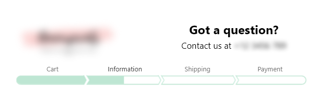
This shows the user where they are in the checkout process. Adding this breadcrumb menu makes it easy for users to navigate back/forth through the checkout funnel without losing progress. They can go back to the information tab, change their information then click back to the payment tab. This significantly reduces user error and provides a better UX on the checkout.
2. Updated Information Step
First we want to remove unnecessary fields.
- Remove Company Name from Field
- Remove Address #2 Field
These are 2 unnecessary steps on the information pages. Removing these will reduce friction on the checkout.
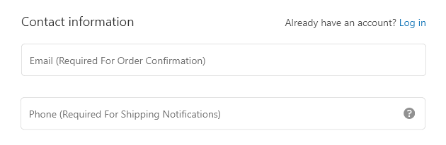
Next lets adjust the verbiage on the placeholders.
- Change Email to > Email (Required for Order Confirmation)
- Change Phone to > Phone (Required for Shipping Notifications)
We recommend changing these placeholders to the above. The reason behind this is simple. Your customers want to know why you need their information. By providing context on why you need this information, it builds trust. The customer will know that you need their phone number for shipping notifications, and you’ll need their email for order confirmation. This removes the barrier of distrust from this step.
You can do this from your Shopify admin by following these steps.
1. Go to Settings > Checkout.
2. In the Form options section, make the appropriate changes.
3. Click Save.
3. Paypal moved to Payment Step

By removing the Paypal button from the Information page of the checkout, it allows us to collect the email & phone number of the customer for retargeting if they abandon their cart. Also by displaying Paypal at the end it reduces confusion on payment methods available. (This can only be achieved by hiding all express payment methods, you cannot solely hide paypal)
4. UVPs in the Side Menu

This is a huge winner across the board in our client stores. Having Unique Value Propositions in the side menu. This is your final chance to convince users to buy from you. Always remember, every step in the buying process is going to come with its own objections that will cause new potential customers to bounce from your website. The more relevant information we can provide throughout each step of the buying process, the more objections we can eliminate which equates to more traffic being converted into buying customers, increasing conversion rate and profitability.
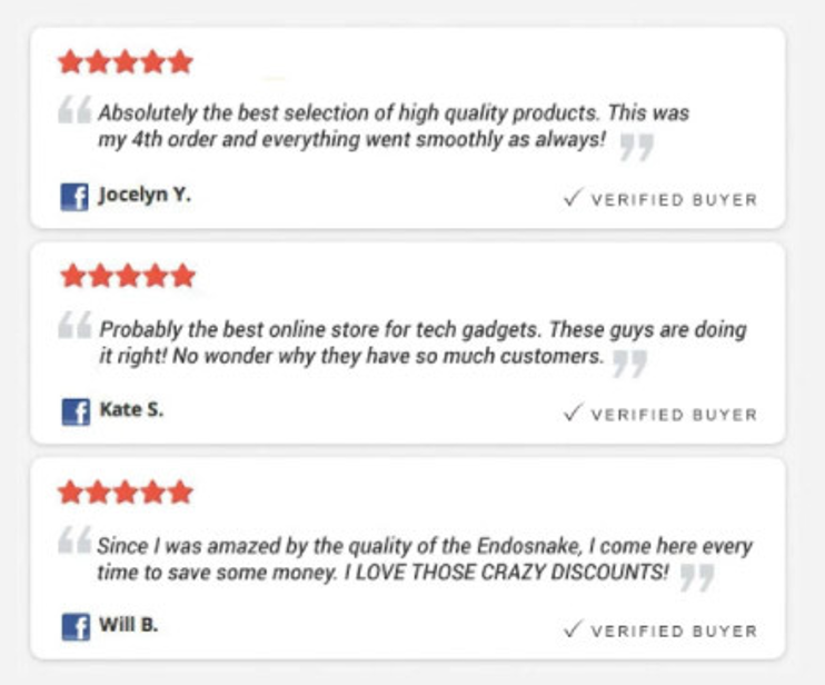
5. Social Proof in the Side Menu

Like the value propositions, social proof boosts your conversion rate significantly. The checkout is a good place to show how trusted your brand is before they enter their credit card information to your store. You can do this in a few ways but we’ve found using Facebook comments like this usually wins:
6. Moving the Newsletter opt-in Checkbox
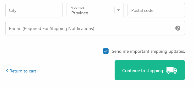
We tested this and saw newsletter opt-in increase by 15-20% in most cases. This tweak will instantly boost your newsletter signups from the checkout page. By moving it above the CTA, users will automatically assume it needs to be checked. This is a psychological trick because users will automatically click checkboxes near CTA on forms, where Terms of Service checkboxes generally are.
7. New and Improved CTAs

These CTAs are bigger, brighter and more relevant than the default Shopify Checkout CTA's. Having prominent CTAs will always increase your Conversion Rate. The color should match the preceding CTA buttons that were displayed on your Product/Cart page. So if they were green, use green here as well.
8.Toll-Free Number or Support Email in the logo
We recommend adding a toll-free number or a support email in the logo. It helps build trust with the user. And trust = conversions. We’ve found that practically nobody will call the toll-free number anyway, so don’t worry about a bunch of people calling it.
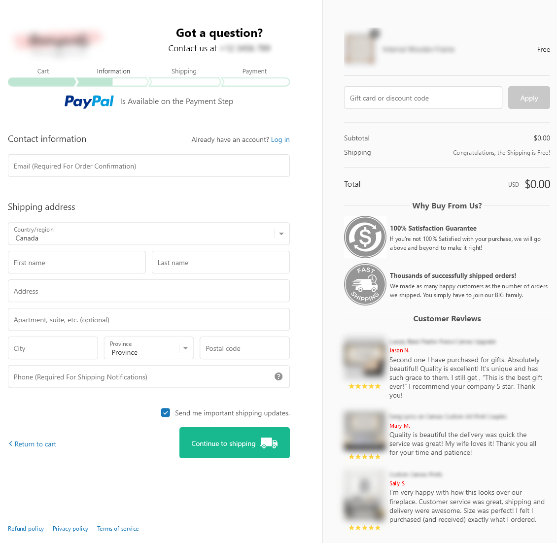
The Final Result
If you implement all of these changes your checkout should look something like this:
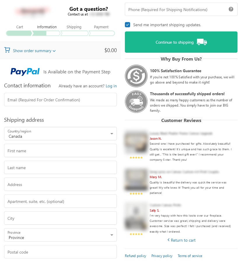
And for mobile:
If you are on Shopify Plus, you can implement these changes using checkout.liquid. If you aren’t using checkout.liquid anymore, you can implement these changes using Checkout Extensions. If you need help implementing these optimizations, feel free to book a call with us.

.svg)

.png)

.svg)
.svg)